
Technology
Best AI Chatbot for Humanlike Writing: Blogs, Emails and Social Posts

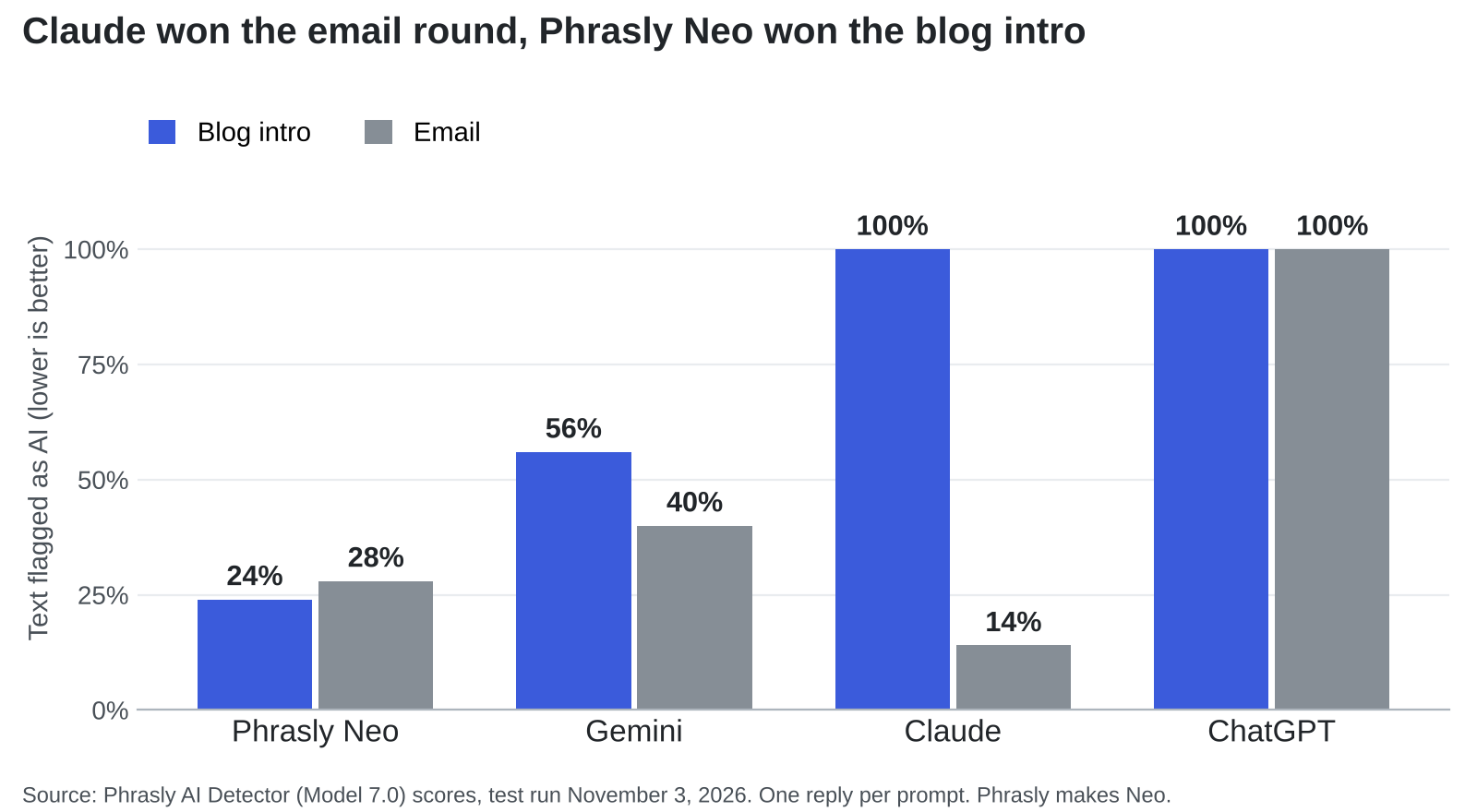
Nearly one in five people have unsubscribed from a brand’s emails for one reason: they suspected a machine wrote them. Adobe Express put that figure at 18% in its 2026 survey of 1,007 US consumers. Look at the word “suspected” again. Nobody needed proof.
That’s the problem with picking a chatbot from a single ranked list. A blog post, a client email, and a LinkedIn update fail in different ways, so one winner rarely covers all three. Here’s what the evidence says for each format, where that evidence runs out, and how to test any chatbot on your own writing in about ten minutes.
The short answer: choose Phrasly Neo for blog drafts and Claude for emails. For social posts, go with whichever chatbot you can teach using your own past posts.
What a Robotic Draft Costs on Each Channel
Email: Suspicion Alone Can Lose a Subscriber
In the same Adobe Express survey, 46% said they’d be more likely to unsubscribe if an email was clearly written by AI. Validity’s 2026 research, which drew on 1,000 US consumers, found that 40% would trust a retailer’s emails less if they knew AI wrote them.
There’s a fair counterpoint. Adobe also found that 37% don’t mind an AI-sounding email as long as it’s useful and relevant. Usefulness buys some forgiveness, just not from everybody.
Social: LinkedIn Now Limits Generic AI Posts
Detection company Pangram scanned more than one million posts from April to June 2026 and flagged 41% of LinkedIn posts over 250 words as fully AI-generated, the highest rate among the five platforms it studied. LinkedIn is pushing back. Laura Lorenzetti, the company’s executive editor, told Entrepreneur in May 2026 that flagged posts won’t be deleted, but their reach will often stop at the author’s first-degree connections.
LinkedIn says it isn’t trying to penalize people for using AI tools. Its target is low-value content with no original insight, which is a much harder thing to hide.
Blogs: AI Pages Can Rank, but Lighter Use Leads
Ahrefs’ July 2026 study found that 5.3% of pages in Google’s top three positions were 100% AI-generated, so fully automated pages can clearly rank. Still, pages with less than 50% AI content held 82.2% of those spots, and pages with low or moderate AI use earned two to three times the impressions of AI-heavy ones. Ahrefs is careful to call this a correlation, since AI-heavy sites may simply be newer or weaker to begin with.
How Four Chatbots Scored on Blog and Email Drafts
On November 3, 2026, Phrasly gave ChatGPT, Gemini, Claude, and Phrasly Neo identical prompts on their default models, with no custom instructions and no regenerations. The first reply from each went through the Phrasly AI Detector, which reports the share of text flagged as AI. Lower is better.
Neo won the blog intro at 24%. Claude produced the strangest result, scoring 100% on the blog intro and then 14% on the email; the only reply in the test was rated likely human. Six outside detectors backed up both Claude results: all six flagged the blog intro, and all six passed the email. ChatGPT’s default replies scored 100% in both rounds.
Please read those numbers with some caution. Phrasly makes both Neo and the detector. Each chatbot wrote one reply per prompt on one day, and ChatGPT’s email had to be rerun with a word range because its first attempt was too short to score. A detector also can’t tell you whether a draft is accurate, persuasive, or anything like your voice.
Social posts weren’t part of this test, and I couldn’t find a comparable public one. Treat the social advice below as my own judgment.
The Right Chatbot for Each Format
| Chatbot | Best format | Voice controls | Free plan | First paid step |
| Phrasly Neo | Blog drafts and rewrites | Follow-up edits, humanizer in chat | Yes, with daily limits and 500-word documents | $10.99 a month, billed annually |
| Claude | Emails and edited long-form | Custom instructions and skills | Yes | Pro, $17 a month, billed annually |
| ChatGPT | Mixed formats and connected work apps | Tone presets, Writing Style on paid plans | Yes | Go, $8 a month |
| Gemini | Drafting around Google apps | Gems with instructions and files | Yes | AI Plus, $4.99 a month |
Prices come from Phrasly’s pricing page and Zapier’s October 2026 chatbot roundup, so confirm them before you buy.
Blog Posts: Phrasly Neo Keeps Every Pass in One Place
A blog post rarely survives on its first draft. You outline, write, cut, rewrite the stiff parts, and check the result, and each trip to another app loses a little context. That’s the case for Neo as the best AI chatbot for humanlike writing on longer work. It drafts on a page beside the chat, saves to Phrasly Docs, and can humanize a draft or check it for AI in the same window, depending on your plan.
Two limits are worth knowing. Free documents stop at 500 words, so full articles need a paid plan. And Neo’s essay in the test leaned on unnamed “studies,” which is exactly the kind of line you should source or delete before publishing.
Emails: Claude Handles Short Messages With a Clear Job
Claude’s 14% was the best email score in the test, and Zapier’s October 2026 roundup also picks it for writing and coding. It still needs a firm editor. When Phrasly had Claude draft 10 fictional cold emails, 7 opened with “I saw” and 8 reused lines from the voice sample almost word for word.
The fix is better raw material. This guide to humanizing AI cold emails comes down to one verified reason for writing, one fitting offer, and a human edit before anything gets sent.
Social Posts: Pick the Chatbot That Learns From You
A short post runs on personality, and no default model has yours. Voice controls matter more here than any benchmark. Anthropic is moving Claude’s custom styles into skills, ChatGPT offers presets such as Candid and Efficient, and Gemini’s Gems store standing instructions alongside reference files.
Give your chosen tool five posts that did well for you, then add what it can’t invent: a real opinion, a number from your own work, or something that happened this week. LinkedIn’s crackdown is aimed squarely at posts missing that ingredient.
A Ten-Minute Test to Run Before You Commit
Reviews can narrow the field, but your own draft settles it.
- Choose one real job, such as an email you need to send this week.
- Paste the same brief and two samples of your writing into each chatbot.
- Keep the first reply. Regenerating until something sounds good flatters every tool.
- Read each draft aloud and mark any line you’d never say.
- Check every name, date, and figure against your notes.
- Count your edits. The draft that needs the fewest, with its meaning intact, wins.
If the winner is close but still stiff, Phrasly Ultra can rewrite it on paid plans and trials, and the free AI Detector will score it and, once you’re signed in, highlight the sentences that still look machine-made. Reread the result afterward, because a full rewrite can change names, dates, and calls to action.
Choose the Draft You’d Change the Least
Readers rarely run your work through a detector. They just notice when a message could have been sent by anyone, and then they unsubscribe, scroll past, or stop trusting you. The chatbot can reduce that risk, though it can’t remove it.
So match the tool to the job. Use Neo when a blog post needs several passes in one place, Claude when an email has to sound like a person, and a voice-trained chatbot when a social post depends on your personality. Then run the ten-minute test, keep the draft you’d change the least, and add the one detail only you could have written.


Mud rarely appears as a line in a project budget, yet it costs money in many small ways. A site that ignores it often pays through clean-up bills, lost time and strained relationships. Looking at those costs side by side makes the case for prevention easier.
The visible costs
The most obvious expense is cleaning. Hiring a road sweeper regularly, or even daily during wet weather, adds up quickly over a long project. If a highway authority steps in and cleans the road itself, it usually recovers the cost from the contractor. Fines and enforcement notices are a further risk when a site repeatedly fails to keep the road clean.
The hidden costs
Delays are harder to measure. A stop-work instruction after a complaint, a meeting with the council or an extra clean-up shift all take managers away from the actual build. Mud also wears equipment faster, because wet soil in wheel arches and on tracks adds weight and hides defects until they become expensive.
Reputation and relationships
Neighbours notice dirty roads before they notice anything else about a site. A steady stream of complaints can damage relationships with local residents, councillors and the client. On projects where goodwill matters, this can influence later approvals and future work.
What prevention costs
A wheelwash system involves an upfront investment or a rental fee, plus water, power and routine maintenance. Systems that recycle water keep the running cost down. Compared with weeks of repeated sweeping and disputes, many contractors find that the equipment pays back within a single wet season on a busy site.
How to do your own calculation
List what mud costs your current projects: sweeper hire per week, hours spent on clean-up and complaint handling, any enforcement action, and the effect of delays. Then compare the total with the cost of renting or buying a cleaning system over the same period. Include installation, water and sludge disposal in the second figure for an honest comparison.
When the numbers matter most
Prevention pays most where soil is heavy clay, traffic is frequent and the site is close to homes or busy roads. On a small job with a single exit and dry ground, a lighter solution may be enough. The right answer depends on your conditions, not on a rule of thumb.
Conclusion
The cheapest mud is the mud that never reaches the road. Contractors who count the hidden costs usually find that a good cleaning facility is not an extra but a way of protecting time, budget and reputation.


Every hardware company reaches the same decision: build boards yourself, or hand PCB assembly to someone else. A small SMT line looks affordable until you add ovens, inspection gear, trained operators and a stockroom. Outsourcing looks simple until a supplier misses a deadline. Neither path is automatically better. This guide explains how EMS manufacturing works, where in-house assembly still wins, and how to choose the right model for your volumes and risk tolerance.
What Is EMS Manufacturing?
EMS manufacturing refers to Electronics Manufacturing Services: contract providers that build electronic products for other companies, known as OEMs. The scope runs from basic PCB assembly to component procurement, testing, box build and logistics. Some OEMs outsource only the boards and finish the product themselves. Others hand over the entire chain, from purchasing to shipping.
What Are the Benefits of Outsourcing PCB Assembly?
Outsourcing PCB assembly lowers upfront investment, gives you access to modern equipment and lets you scale output without hiring. You pay per unit or through setup fees instead of carrying fixed costs whether the line is busy or idle.
Lower Capital and Variable Costs
An in-house line costs the same in a slow month as in a busy one. An EMS partner spreads equipment and labor across many customers, so your cost moves with your order volume. Savings estimates vary widely between sources, and the real figure depends on your volumes, so treat any single percentage with caution.
Certifications and Process Maturity
Established EMS providers typically already hold quality certifications and run documented inspection routines. Building that capability yourself means hiring quality staff and earning audits from scratch.
When Does In-House PCB Assembly Make More Sense?
In-house assembly makes more sense when you need tight control over sensitive designs, run very high volumes of one stable product, or iterate on prototypes daily. It also suits companies that already own the equipment and the people to run it.
The trade-offs are real:
- Equipment and floor space tie up capital.
- Skilled operators and process engineers are hard to hire and keep.
- Volume swings leave the line either idle or overloaded.
What Are the Risks of EMS Manufacturing?
The main risks are quality drift, supply disruption, communication gaps and intellectual property exposure. The wrong partner can erase every benefit above through delays and rework.
You can manage most of these. Sign an NDA, define acceptance criteria in writing, and ask how the provider handles component shortages before you place an order. For sensitive designs, some companies keep final assembly or firmware loading in-house and outsource the rest.
Which Products Suit EMS Manufacturing?
Most electronics suit it, but the fit varies. Consumer devices benefit from scale and fast turnaround. Industrial control PCBA often needs long product lifecycles, component traceability and stable sourcing, so you should ask whether a provider can support the same board for years instead of months. Medical, automotive and aerospace builds add regulatory documentation on top.
Can You Combine In-House and Outsourced PCB Assembly?
Yes, and a hybrid model is common. A typical split keeps prototypes and pilot runs in-house, then moves volume production to an EMS partner. Another keeps test development internal while the partner handles assembly and box build. This works well when your design is still changing but your demand is growing.
How Do You Choose an EMS Partner?
Decide first what you’re outsourcing: boards only, full builds, or the entire supply chain. Then judge providers on:
- Their DFM feedback before quoting
- Test and inspection capability
- Component sourcing and shortage handling
- Experience with products like yours
- How quickly engineers respond
Invite two or three providers to review your files. Their questions will tell you more than their brochures.
Conclusion
Outsourcing PCB assembly suits companies that want flexibility, lower capital cost and access to mature processes. In-house assembly suits those that value control above all. Many land somewhere between. Start by listing your volumes, your IP concerns and your quality requirements, then choose the model that fits them.
Technology
Red, amber, green and the one in twelve men who cannot tell them apart: designing dashboards everyone can read
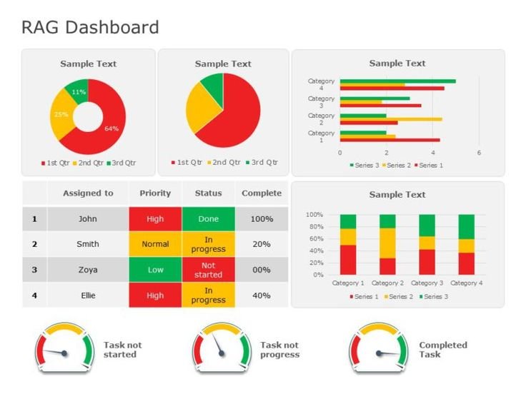
Picture a Monday operations meeting. The sales dashboard goes up on the wall screen, twenty tiles in a grid, each one coloured red, amber or green to show whether a region is on target. The director asks the room what needs attention this week, and most people point at the three red tiles straight away. One of the regional managers says nothing, because to him the red and the green tiles look much the same shade of brownish grey, and he has spent the last minute reading the small numbers underneath instead, working out for himself which ones are the problem.
He has plenty of company. The National Eye Institute in the United States puts colour vision deficiency at about one man in twelve. A peer-reviewed review in the journal Eye (Simunovic, 2010) gives a similar picture, with inherited colour vision deficiency affecting up to 8% of males and around 0.5% of females. In a company of 120 people, that is likely to be eight or nine colleagues, and there is a fair chance at least one of them sits in a meeting where a traffic-light dashboard is the main thing on the screen.
What the traffic lights look like to them
Colour vision deficiency, often called colour blindness although very few people see no colour at all, usually comes down to a weakness in one of the three types of light-sensitive cone cells in the eye. The two most common forms both affect the red and green cones, which is why red and green are the pair people have trouble telling apart. Pure red and pure green on a white background can often be separated by brightness alone. Problems start when a designer picks a softer palette, or when amber enters the picture, because amber sits between red and green and tends to collapse into both.
So a red, amber, green status column, with no other cue, asks a chunk of the audience to guess. They will usually guess correctly using context, or read the raw figures, or ask a colleague after the meeting. All of which takes time and attention that the dashboard was supposed to save.
The same visual breaks down for everyone else more often than people expect. Meeting-room projectors wash out saturated colours. A report printed on a black-and-white office printer turns every status into a grey square, and a phone screen outside on a bright afternoon does something similar. Designing for the one in twelve means the report survives those situations as well.
The grey text and the pale gridline
Contrast is the second accessibility fault in dashboards, and it catches far more readers than colour alone does.
The WebAIM Million, an automated survey of the top one million website home pages, found in its February 2026 run that 83.9% of them contained text with insufficient colour contrast, up on the 79.1% recorded a year earlier. Those are home pages built by professional web teams. Business dashboards are rarely built with that level of attention, and the default styling of many charting tools leans towards light grey axis labels, pale gridlines and thin pastel legends because they look clean on a designer’s large monitor.
On a wall screen three metres away, light grey on white vanishes. The reader can see the bars but not the months along the bottom, or the scale up the side, so a chart that looked tidy in Power BI Desktop becomes a set of coloured shapes with no reference points. The fix costs nothing: dark text on a light background, gridlines either dark enough to see or removed altogether, and legend labels in the same size and weight as body text. Labels that are only decoration can go, and the ones that carry meaning need to be legible at the distance the audience will read them.
Pair colour with shape, text or position
Nobody is suggesting dashboards go monochrome. Colour is a fast, pleasant signal for the roughly eleven in twelve who read it comfortably. The design rule, borrowed from web accessibility guidance, is that colour should never be the only way a piece of information is conveyed.
In practice that means three habits. Add a shape: an upward or downward arrow, a tick or a cross, a filled or hollow circle next to the colour. Write it out as text, because a tile that says “6% behind target” in words is readable by everyone, including the person reading it aloud on a conference call to colleagues who cannot see the screen. And use position, by sorting the table so the regions furthest behind sit at the top where the eye goes first, so the ordering itself tells the story without any colour at all.
There is a quick test for whether this has worked. Print the page in greyscale, or switch on the colour filter in Windows accessibility settings and set it to simulate deuteranopia (the most common red-green form). If the status of each item is still obvious, the design is sound. If every tile goes the same mid grey and nothing on the page tells you which region is behind, the colour was carrying the whole message.
Fewer numbers on the page
Accessibility and plain readability overlap more than people assume. A page with thirty figures on it is hard work for anyone, and it is harder still when some of those figures are differentiated only by a hue the reader cannot see.
A useful discipline is to decide, before opening the tool, what question this page answers and which three or four numbers answer it. Everything else moves to a second page or a drill-through (a click that opens the detail behind a figure). Each number then gets room: a readable label, a comparison with target or with last period written in words, and a colour cue backed up by one of the methods above. Red Eagle Tech has published a set of worked Power BI dashboard examples showing what this looks like when each page is organised around one decision rather than around everything the data happens to contain.
The result is often a report with more pages and less on each one, which can feel like a step backwards to anyone who grew up with the single giant spreadsheet tab. It reads faster in a meeting, and it reads at all for the colleague with colour vision deficiency.
Why this is learned fastest with someone critiquing your work
Everything above can be read in an afternoon. Turning it into habit is another matter, because the person building the report is also the person least able to see its faults. They know what the colours mean and which tile is the problem region, and they chose the pale grey because it looked elegant on their own monitor. The faults only show when somebody else sits in front of the report cold and tries to answer a question with it.
That is why report design sticks fastest in a hands-on setting where you build something and then have it pulled apart in front of you. Red Eagle Tech, a North London software and Power BI training company and a Microsoft Partner, runs this two-day course live online over Microsoft Teams, so delegates anywhere in the UK can join a small group where every exercise is built on real datasets and reviewed with the trainer. The sixth of its seven modules is given over to designing interactive reports, covering report design practice, custom visuals and row-level security (the permissions that control who sees which rows of data). The trainer has led Power BI training across a FTSE 100 company, the firm has trained more than 200 people, and Clutch named it a Top Power BI & Data Solutions Company in London for 2026. The fee is £600 + VAT per person.
The lasting lesson in that kind of session is usually the moment a colleague squints at your chart and asks what the grey line means, and you realise nobody had asked before.
A ten-minute check before the next meeting
Open the report you will present next week. Switch on the greyscale filter and look at it as the one in twelve will. Then zoom the browser out to roughly the size it will appear on the wall screen and see whether the axis labels are still readable where you sit. Whatever fails those two checks is the thing to fix first, and in most reports it is a single colour-only status column and one set of light grey labels. Both can be changed before Monday.

Best AI Chatbot for Humanlike Writing: Blogs, Emails and Social Posts

From Dalmatian Spots to Bubblegum Pink: A Custom Latex Catsuit Brief

The Real Cost of Mud: Why Cleaning Vehicles at the Gate Pays for Itself

Best Place to Buy Business Laptops in Bulk in the UK

Seedworld, a Red Coat, and the Weather in a Fashion Story

Who Is Indiana Urban? Inside the Life of Karl Urban’s Son and Rising Actor

Jennifer Seyfried: All About Amanda Seyfried’s Sister, Her Life and Career

Who Is Zachary Hudson? Inside the Private Life of Cindy Williams’ Son

Who Is Stephen G. Walker? All About PinkPantheress’ Father and His Academic Career

Cynthia Womack Biography: The Life, Career, and Legacy of Connie Britton’s Twin Sister
Who Is Indiana Urban? Inside the Life of Karl Urban’s Son and Rising Actor
Jennifer Seyfried: All About Amanda Seyfried’s Sister, Her Life and Career
Who Is Zachary Hudson? Inside the Private Life of Cindy Williams’ Son
Who Is Stephen G. Walker? All About PinkPantheress’ Father and His Academic Career
Cynthia Womack Biography: The Life, Career, and Legacy of Connie Britton’s Twin Sister
-
Biography8 months ago
Who Is Indiana Urban? Inside the Life of Karl Urban’s Son and Rising Actor
-
Biography8 months ago
Jennifer Seyfried: All About Amanda Seyfried’s Sister, Her Life and Career
-
Biography8 months ago
Who Is Zachary Hudson? Inside the Private Life of Cindy Williams’ Son
-
 Biography7 months ago
Who Is Stephen G. Walker? All About PinkPantheress’ Father and His Academic Career
-
Biography9 months ago
Cynthia Womack Biography: The Life, Career, and Legacy of Connie Britton’s Twin Sister
-
 Biography8 months ago
Lynn Payne: Inside the Life and Love Story of Randy Savage’s Wife
-
 Biography8 months ago
Who is Lynn Levesque? Everything to Know About Triple H’s Sister
-
 Biography9 months ago
Who Was Gretchen Knauff? The Private Life of Jennifer Coolidge’s Mother